STA 302 / 1001 F -- Regression Analysis
-- Fall 2007
SAS examples from lecture:
Snow gauge example:
Data (text)
SAS code (text)
SAS log (text)
SAS output (.lst) (text)
Plot of gain vs density (jpg)
Plot of log(gain) vs density (jpg)
Plot of log(gain) vs density with regression line (jpg)
Plot of residuals vs density (jpg)
Plot of residuals vs predicted values (jpg)
Anscombe example (4 made-up datasets):
SAS code (including data) (text)
SAS output (text)
Scatterplot of y1 vs x1 (pdf)
Scatterplot of y2 vs x1 (pdf)
Scatterplot of y3 vs x1 (pdf)
Scatterplot of y4 vs x2 (pdf)
Scatterplot of y1 vs x1 with regression line (pdf)
Scatterplot of y2 vs x1 with regression line (pdf)
Scatterplot of y3 vs x1 with regression line (pdf)
Scatterplot of y4 vs x2 with regression line (pdf)
Smoking and cancer example:
Data (text)
SAS code (text)
SAS output (.lst) (text)
Scatterplot (pdf)
Scatterplot with regression line (pdf)
Plot of residuals versus smoking index (pdf)
Plot of residuals versus predicted values (pdf)
Crime and population example:
SAS code (including data) (text)
SAS output (text)
Scatterplot of Number of violent crimes vs Population (all data points) (pdf)
Scatterplot of Number of violent crimes vs Population (all data points) with regression line (pdf)
Scatterplot of Number of violent crimes vs Population with regression line with New York City deleted (pdf)
Scatterplot of Number of violent crimes vs Population with regression line with New York City, Boston and Washington deleted (pdf)
Non-technical description of analyses including and not including New York (text)
SAS code with simple option on proc reg
SAS output with simple option on proc reg
t-test examples:
Schizophrenia twins (paired t-test):
SAS code
and
Output
Sparrows (two-sample t-test):
SAS code
and
Output
Snow gauge example with confidence and prediction intervals:
SAS code (text)
SAS output (including lineprinter plots) (text)
Plot of confidence intervals for mean of Y (pdf)
Plot of prediction intervals for Y (pdf)
Plots of confidence and prediction intervals for smoking and cancer example:
Plot of confidence intervals for mean of Y (pdf)
Plot of prediction intervals for Y (pdf)
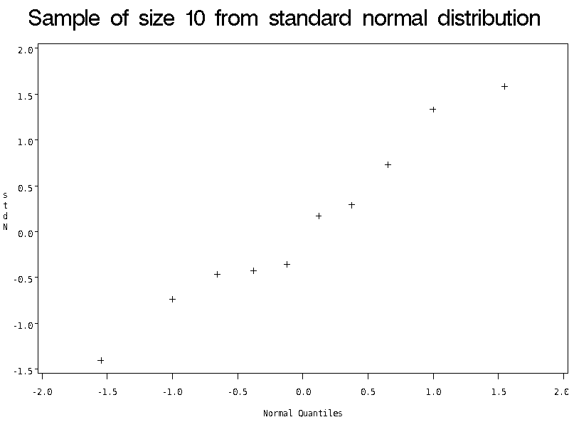
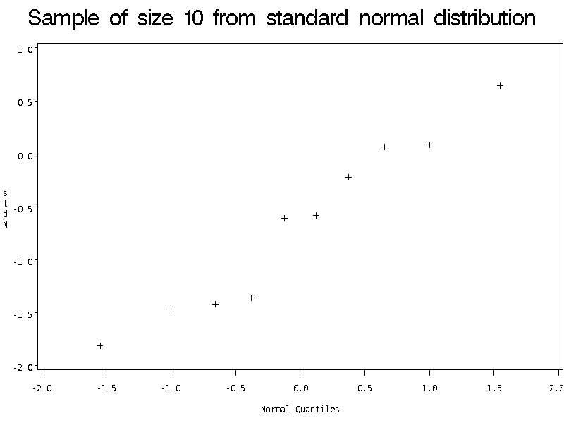
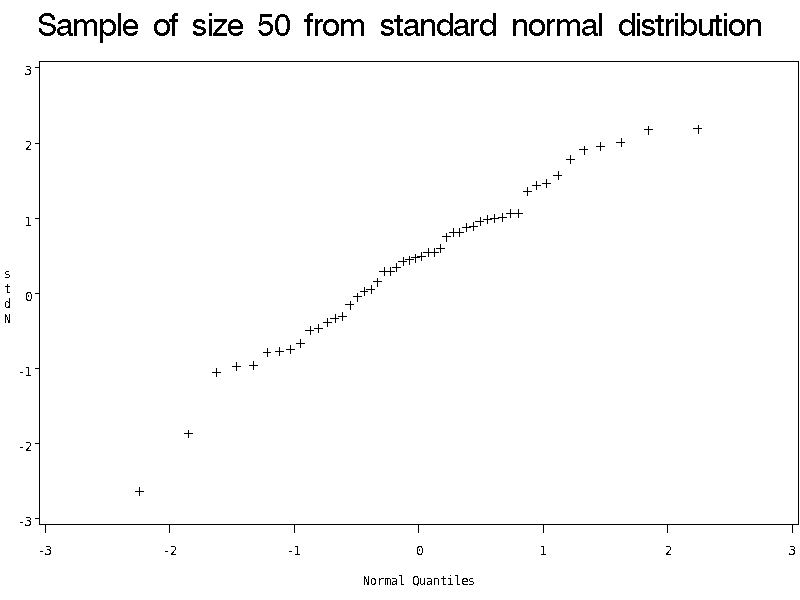
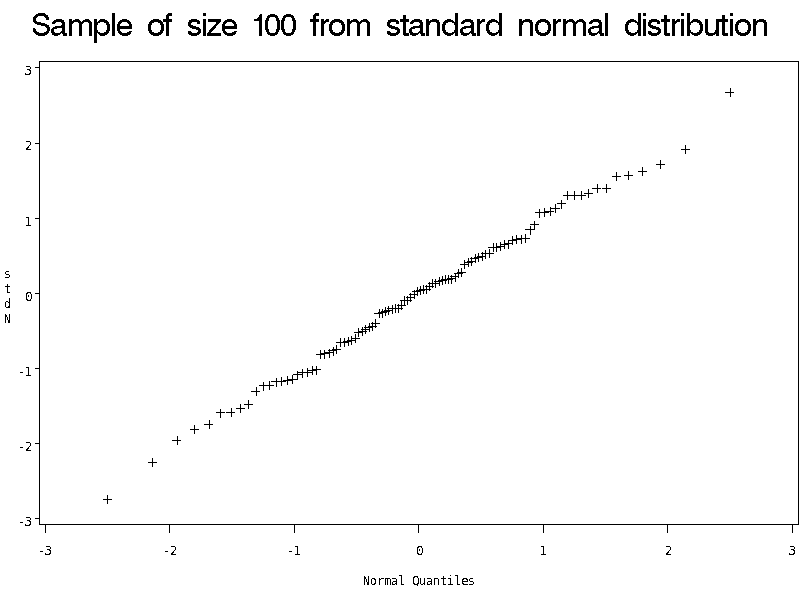
Normal quantile plots for simulated data (for Chapter 3):
Data are random sample of size 10 from standard normal distribution
Data are a second random sample of size 10 from standard normal distribution
Data are random sample of size 50 from standard normal distribution
Data are random sample of size 100 from standard normal distribution
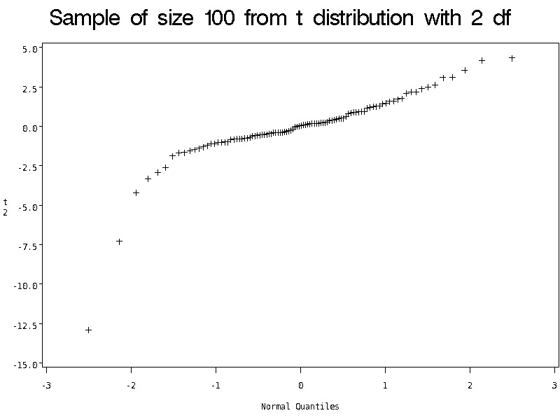
Data are random sample of size 100 from t distribution with 2 df (heavy tails)
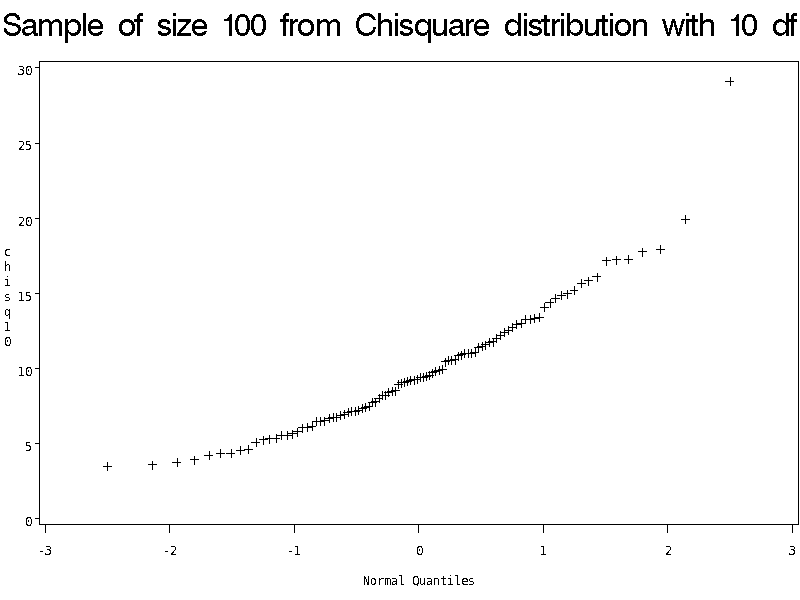
Data are random sample of size 100 from chisquare distribution with 10 df (right-skewed)
Crime example residual plots (for Chapter 3):
Residuals versus predicted values plot (pdf)
Normal quantile plot of residuals (pdf)
Corrosion example (for Chapter 3):
SAS code (including data) (text)
SAS output (text)
Scatterplot with regression line (pdf)
Plot of residuals versus predictor variable (pdf)
Plot of residuals versus fitted values (pdf)
Normal quantile plot of residuals (pdf)
Sequence plot of residuals (pdf)
Plot of absolute value of residuals versus fitted values (pdf)
Breakdown example (for Chapter 3):
SAS code (text)
Data (text)
SAS output file (text)
Scatter plot for untransformed data with regression line (pdf)
Residuals versus X plot for untransformed data (pdf)
Residuals versus predicted values plot for untransformed data (pdf)
Normal quantile plot of residuals for untransformed data (pdf)
Scatter plot for data with square root of Y with regression line (pdf)
Residuals versus predicted values plot for data with square root of Y (pdf)
Normal quantile plot of residuals for data with square root of Y (pdf)
Scatter plot for data with log of Y with regression line (pdf)
Residuals versus predicted values plot for data with log of Y (pdf)
Normal quantile plot of residuals for data with log of Y (pdf)
Scatter plot for data with 1/Y with regression line (pdf)
Residuals versus predicted values plot for data with 1/Y (pdf)
Normal quantile plot of residuals for data with 1/Y (pdf)
Chicago house sales example (for Chapter 6):
Data (text)
SAS code (text)
SAS output (text)
Pairwise scatterplots of all variables (pdf)
Residuals versus first four predictor variables (pdf)
Residuals versus last four predictor variables (pdf)
Residuals versus fits and normal quantile plot of residuals (pdf)
Meadowfoam experiment (indicator variables and the partial F test (Chapters 7 and 8)):
Data (text)
SAS code (text)
SAS output (text)
More on the meadowfoam example (ANCOVA (Chapter 8)):
SAS code (text)
SAS output (text)
Plot of number of flowers per plant versus light intensity, coded for timing (pdf)
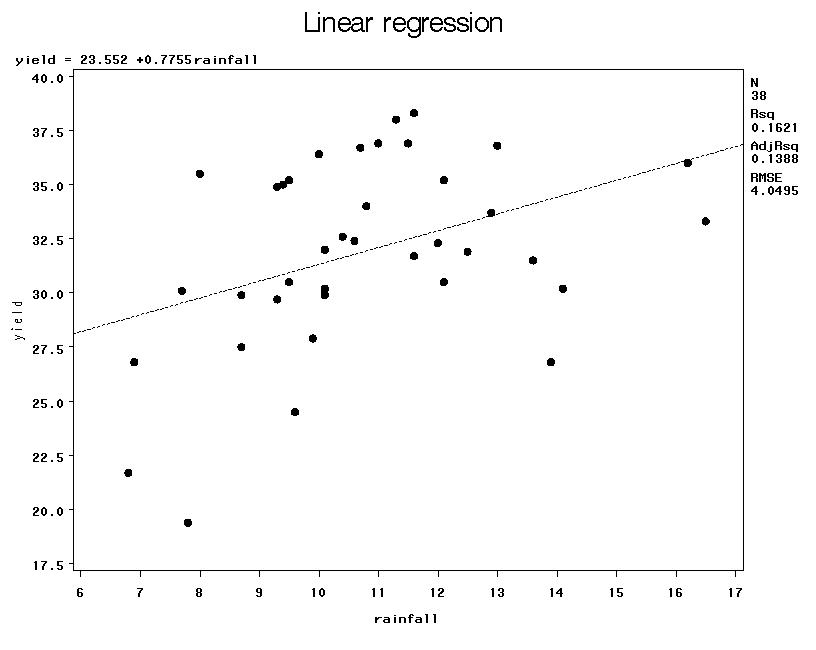
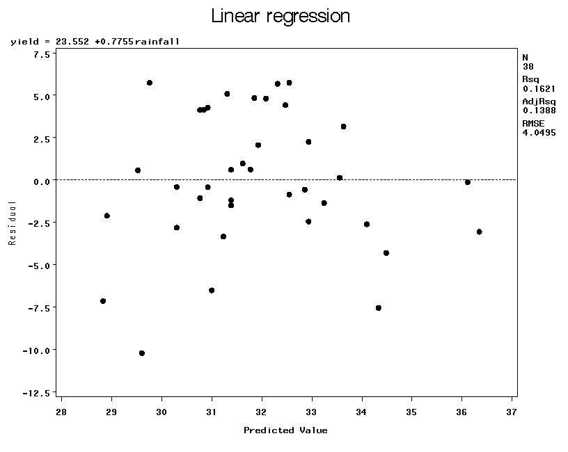
Rainfall and corn yield (Chapters 7 and 8):
Data (text)
SAS code (text)
SAS output (text)
Scatterplot of yield versus rainfall with simple regression line (jpeg)
Plot of residuals versus predicted values for simple regression (jpeg)
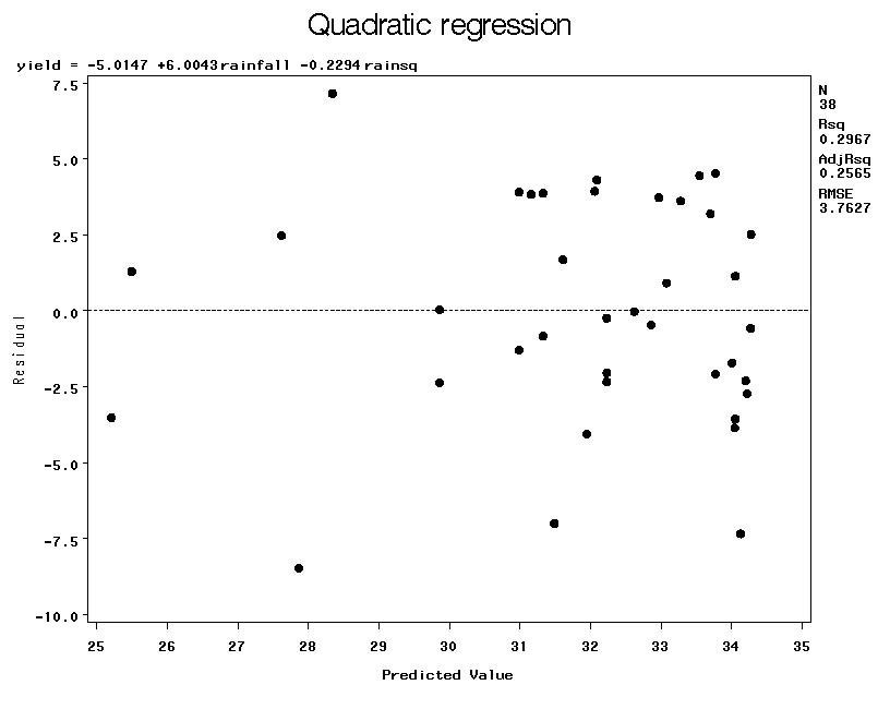
Plot of residuals versus predicted values for quadratic regression (jpeg)
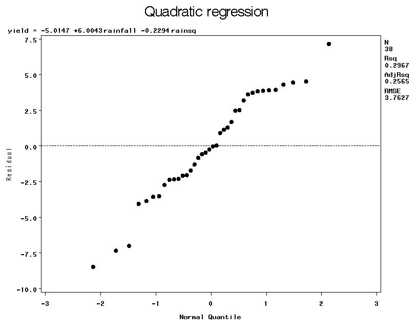
Normal quantile plot of residuals for quadratic regression (jpeg)
Plot of residuals versus year for quadratic regression (jpeg)
Brain size in mammals (multiple regression, log-log transformation):
Data (text)
Pairwise scatterplots of raw data (pdf)
Pairwise scatterplots of log data (pdf)
SAS code (text)
SAS output (text)